Joe is ready to buy his first (used) car as anyone does when they are new to the whole driving experience.
After a careful search on craigslist, he narrowed down to check out a 2003 Ford Focus and a 2011 Hyundai Sonata Hybrid. He liked their specs and wanted to verify the all-important gas mileage.
While he is taking the words of the owners at face value, he also wants to check the mileage reported by the general public to the EPA.
In case you are unaware, the United States Environmental Protection Agency (USEPA) maintains a website www.fueleconomy.gov where they provide information on the fuel economy for different vehicles. They give their rating based on standardized tests to reflect typical driving conditions and driver behavior. The public also shares their miles per gallon (MPG) estimates.
At any rate, Joe navigated through this interesting website and checked out the data that people shared for these two varieties.
Here is the data shared by eight people for the 2003 Ford Focus.
As you can see, EPA rates an average of 26 MPG for this variety.
Joe wants to check if the average mileage for this car as derived from a sample data conforms to the EPA rating or not.
Joe already knows how to do this using the one-sample t-test. So he goes about establishing the null and the alternative hypothesis, deciding on the acceptable rejection rate, computing the test statistic and its corresponding p-value.
Here is a summary of his test.
From the sample of eight vehicles, he computed as 26.69 MPG, which he compares with EPA’s rating — of 26 MPG. The test statistic is 0.52.
His alternate hypothesis is MPG against the null hypothesis of MPG. So, the critical value from the T-distribution with 7 degrees of freedom (n=8) is -1.9.
Since the test statistic is greater than the critical value, he cannot reject the hypothesis.
Until further evidence is available, he will continue to believe that the 2003 Ford Focus will have an average fuel economy of 26 MPG.
Enter the Sign Test
Joe can also perform a One-Sample Sign Test if he needs more confirmation.
The sign test determines whether a given sample X is generally larger or smaller or different than a selected value . It works well when there are outliers in the data.
Joe has to establish the following null hypothesis.
If is true, about half of the values of sample X will be greater than 26 MPG, and about half of them will be less than 26 MPG. In other words, the sample data will be dispersed around with equal likelihood.
To this null hypothesis, he will cast an alternate hypothesis
If is true, more than half of the values of sample X will be less than 26 MPG. In other words, the sample shows low mileages — significantly less than 26 MPG.
Look at this visual. Joe is plotting the sample data on the number line and indicating 26 MPG cutoff line along with whether the sample data is greater than 26 MPG or less than 26 MPG using a plus and a minus sign — the sign test 😉
Three vehicles from the sample had a reported mileage of less than 26 MPG. Out of the eight data points, the number of positives is five, and the number of negative is three.
The number of positives, , is the test statistic for the sign test.
In a sample of eight (n = 8), .
could have been 0, 1, 2, 3, 4, 5, 6, 7, or 8.
Under the null hypothesis, follows a binomial distribution with a probability of 0.5. We consider this as the null distribution.
Look at this visual.
It shows the possible values on the x-axis and on the y-axis. The null distribution is the distribution of the probability that can be 0, 1, 2, …, or 8. For n = 8 and p = 0.5.
For instance,
Here is the full binomial table.
Now, since the sample yields , p-value for this test is the probability of finding up to five positives — .
Since the p-value is greater than 0.05, the rejection rate Joe has decided upon; he cannot reject the null hypothesis.
If you noticed, the sign test only uses the signs of the data and not the magnitudes. So it is resistant to outliers.
What about Hyundai Sonata Hybrid
Joe quickly looks for some data on the 2011 Hyundai Sonata Hybrid. Sure enough, he finds this.
There is a sample of 24 vehicles of this type, and EPA rates this at 36 MPG.
Let’s see how Joe uses the sign test to verify if the sample data conforms to the EPA specified rating.
He first establishes the null and the alternative hypothesis.
If is true, about half of the 24 values found in the sample will be greater than 36 MPG, and about half of them will be negative.
If is true, more than half of the 24 values will be less than 36 MPG. In other words, the sample reveals a significantly lower mileage than the EPA rated 36 MPG.
Joe then plots the data on the number line to visually find the number of positive and negative signs.
He counts them as 7.
There is one number that is exactly 36 MPG. He removes this from the sample and conducts the test with 23 data points.
The test statistic is out of 23 values (n = 23). The p-value for the test is then the probability of seeing value for of up to 7 in a binomial distribution with n = 23 and p = 0.5.
Since the p-value is less than , Joe has to reject the null hypothesis that the average mileage for the 2011 Hyundai Sonata Hybrid is 36 MPG.
Why can’t Joe just conduct the t-test?
He can. Here is the result of the t-test.
The test statistic falls in the rejection region, i.e., , or the p-value is less than .
He will reject the null hypothesis test.
What about the outliers?
Suppose there is an error in entering the 21st value. Let’s say it is 48.8 MPG instead of 38.8 MPG.
How will this change the result of the t-test?
and s will be 33.875 MPG and 6.099 MPG respectively.
The test statistic will be -1.706.
At 5% rejection rate and 23 degrees of freedom, will be -1.713.
Since , Joe would not be able to reject the null hypothesis.
Whereas, if he uses the sign test for his investigation, as he is doing now, the outlier data point 48.8 MPG will still show up only as a positive sign and the resultant will still be seven and the p-value will still be 0.046.
The sign test is resistant to outliers.
If you find this useful, please like, share and subscribe. You can also follow me on Twitter @realDevineni for updates on new lessons.
Joe is cheery after an intense semester at his college. He is meeting Devine today for a casual conversation. We all know that their casual conversation always turns into something interesting. Are we in for a new concept today?
Devine: So, how did you fare in your exams.
Joe: Hmm, I did okay, but, interestingly, you are asking me about my performance in exams and not what I learned in my classes.
Devine: Well, Joe, these days, the college prepares you to be a good test taker. Learning is a thing of the past. I am glad you are still learning in your classes.
Joe: That is true to a large extent. We have exams after exams after exams, and our minds are compartmentalized to regurgitate one module after the other — no time to sit back and absorb what we see in classes.
By the way, I heard of an intriguing phenomenon from one of my professors. It might be of interest to you.
Devine: What is it.
Joe: In his eons of teaching, he has observed that the standard deviation of his class’s performance is 16.5 points. He told me that over the years, this had fed back into his ways of preparing exams. It seems that he subconsciously designs exams where the students’ grades will have a standard deviation of 16.5.
Devine: That is indeed an interesting phenomenon. Do you want to verify his hypothesis?
Joe: How can we do that?
Devine: Assuming that his test scores are normally distributed, we can conduct a hypothesis test on the variance of the distribution —
Joe: Using a hypothesis testing framework?
Devine: Yes. Let’s first outline a null and alternate hypothesis. Since your professor is claiming that his exams are subconsciously designed for a standard deviation of 16.5, we will establish that this is the null hypothesis.
We can falsify this claim if the standard deviation is greater than or less than 16.5, i.e.,
The alternate hypothesis is two-sided. Deviation in either direction (less than or greater than) will reject the null hypothesis.
Would you be able to get some data on his recent exam scores?
Joe: I think I can ask some of my friends and get a sample of up to ten scores. Let me make some calls.
Here is a sample of ten exam scores from our most recent test with him.
60, 41, 70, 61, 69, 95, 33, 34, 82, 82
Devine: Fantastic. We can compute the standard deviation/variance from this sample and verify our hypothesis — whether this data provides evidence for the rejection of the null hypothesis.
Joe: Over the past few weeks, I was learning that we call it a parametric hypothesis test if we know the limiting form of the null distribution. I already know that we are doing a one-sample hypothesis test, but how do we know the type of the null distribution?
Devine: The sample variance () is a random variable that can be described using a probability distribution. Several weeks ago, in lesson 73 where we derived the T-distribution, and in lesson 75 where we derived the confidence interval of the variance, we learned that follows a Chi-square distribution with degrees of freedom.
Since it was more than ten lessons ago, let’s go through the derivation once again. Ofttimes, repetition helps reinforce the ideas.
Joe: I think I remember it vaguely. Let me take a shot at the derivation 🙂
I will start with the equation of the sample variance .
I will move the term over to the left-hand side and do some algebra.
Let me divide both sides of the equation by .
The right-hand side now is the sum of squared standard normal distributions — assuming are draws from a normal distribution.
Sum of squares of standard normal random variables.
We learned in lesson 53 that if there are n standard normal random variables, , their sum of squares is a Chi-square distribution with n degrees of freedom. Its probability density function is for and 0 otherwise.
Since we have
follows a Chi-square distribution with degrees of freedom.
with a probability distribution function
Depending on the degrees of freedom, the distribution of looks like this.
Smaller sample sizes imply lower degrees of freedom. The distribution will be highly skewed; asymmetric.
Larger sample sizes or higher degrees of freedom will tend the distribution to symmetry.
Devine: Excellent job, Joe. As you have shown is our test statistic, , which we will verify against a Chi-square distribution with degrees of freedom.
Have you already decided on a rejection rate ?
Joe: I will go with a 5% Type I error. If my professor’s assumption is indeed true, I am willing to commit a 5% error in my decision-making as I may get a sample from my friends that drives me to reject his null hypothesis.
Devine: Okay. Let’s then compute the test statistic.
Since we have a sample of ten exam scores, we should consider as null distribution, a Chi-square distribution with nine degrees of freedom.
Under the null hypothesis , for a two-sided hypothesis test at the 5% rejection level, can vary between and , the lower and the upper percentiles of the Chi-square distribution.
If our test statistic is either less than, or greater than the lower and the upper percentiles respectively, we reject the null hypothesis.
The lower and upper critical values at the 5% rejection rate (or a 95% confidence interval) are 2.70 and 19.03.
In lesson 75, we learned how to read this off the standard Chi-square table.
Joe: Aha. Since our test statistic is 14.95, we cannot reject the null hypothesis.
Devine: You are right. Look at this visual.
The rejection region based on the lower and the upper critical values (percentiles and ) is shown in red triangles. The test statistic lies inside.
It is now easy to say that the p-value, i.e., or is greater than .
Since we have a two-sided test, we compare the p-value with .
Hence we cannot reject the null hypothesis.
Joe: Looks like I cannot refute my professor’s observation that the standard deviation of his test scores is 16.5 points.
Devine: Yes, at the 5% rejection level, and assuming that his test scores are normally distributed.
Joe: Got it. If the test scores are not normally distributed, our assumption that follows a Chi-square distribution is questionable. How then can we test the hypothesis?
Devine: We can use a non-parametric test using a bootstrap approach.
Joe: How is that done?
Devine: You will have to wait until the non-parametric hypothesis test lessons for that. But let me ask you a question based on today’s lesson. What is the main difference between the hypothesis test on the mean, which you learned in lesson 87, and the hypothesis test on the variance which you learned here?
Joe: 😕 😕 😕
For the hypothesis test on the mean, we looked at the difference between and . For the hypothesis on the variance, we examine the ratio of to and reject the null hypothesis if this ratio differs too much from what we expect under the null hypothesis, i.e., when is true.
If you find this useful, please like, share and subscribe. You can also follow me on Twitter @realDevineni for updates on new lessons.
Tom grew up in the City of Ruritania. He went to high school there, met his wife there, and has a happy home. Ruritania, the land of natural springs, is known for its pristine water. Tom’s house is alongside the west branch of Mohawk, one such pristine river. Every once in a while, Tom and his family go to the nature park on the banks of Mohawk. It is customary for Tom and his little one to take a swim.
Lately, he has been sensing a decline in the quality of the water. It is a scary feeling as the consequences are slow. Tom starts associating the cause of the poor water quality to this new factory in his neighborhood constructed just upstream of Mohawk.
Whether or not the addition of this new factory in Tom’s neighborhood reduced the quality of water compared to EPA standards is to be seen.
He immediately checked the EPA specifications for dissolved oxygen concentration in the river, and it is required by the EPA to have a minimum average concentration of 2 mg/L. Over the next ten days, Tom collected ten water samples from the west branch and got his friend Ron to measure the dissolved oxygen in his lab. In mg/L, the data reads like this.
1.8, 2, 2.1, 1.7, 1.2, 2.3, 2.5, 2.9, 1.9, 2.2
Tom wants to test if the average dissolved oxygen he sees from the samples significantly deviates from the one specified by EPA.
Does deviate from 2 mg/L? Is that deviation large enough to prompt caution?
He does this investigation using the hypothesis testing framework.
Since the investigation is regarding , the sample mean, and whether it is different from a selected value, it is reasonable to say that Tom is conducting a one-sample hypothesis test.
Tom knows this, and so do you and me — the sample mean () is a random variable, and it can be described using a probability distribution. If Tom gets more data samples, he will get a slightly different sample mean. The value of the estimate changes with the change of sample and this uncertainty can be represented using a normal distribution by the Central Limit Theorem.
The sample mean is an unbiased estimate of the true mean, so the expected value of the sample mean is equal to the truth. . Go down the memory lane and find why in Lesson 67.
The variance of the sample mean is . Variance tells us how widely the estimate is distributed around the center of the distribution. We know this from Lesson 68.
When we put these two together,
or,
Now, if the sample size (n) is large enough, it would be reasonable to substitute sample standard deviation (s) in place of .
When we substitute s for , we cannot just assume that will tend to a normal distribution.
W. S. Gosset (aka “Student”) taught us that follows a T-distribution with (n-1) degrees of freedom.
Anyhow, all this is to confirm that Tom is conducting a parametric hypothesis test.
CHOOSE THE APPROPRIATE TEST; ONE-SAMPLE OR TWO-SAMPLE AND PARAMETRIC OR NONPARAMETRIC — check.
Tom establishes the null and alternate hypotheses. He assumes that the inception of the factory does not affect the water quality downstream of the Mohawk River. Hence,
mg/L
mg/L
The alternate hypothesis is one-sided. A significant deviation in one direction (less than) needs to be seen to reject the null hypothesis.
Notice that his null hypothesis is mg/L since it is required by the EPA to have a minimum average concentration of 2 mg/L.
ESTABLISH THE NULL AND ALTERNATE HYPOTHESIS — check.
Tom is taking a 5% risk of rejecting the null hypothesis; . His Type I error is 5%.
Suppose the factory does not affect the water quality, but, the ten samples he collected showed a sample mean much smaller than the EPA prescription of 2 mg/L, he should reject the null hypothesis — so he is committing an error (Type I error) in his decision making.
There is a certain level of subjectivity in the choice of . If Tom wants to see that the water quality is lower than 2 mg/L, he would perhaps choose to commit a greater error, i.e., select a larger value for .
If he wants to see that the water quality has not deteriorated, he will choose a smaller value for .
So, the decision to reject or not to reject the null hypothesis is based on .
DECIDE ON AN ACCEPTABLE RATE OF ERROR OR REJECTION RATE — check.
Since , the null distribution is a T-distribution with (n-1) degrees of freedom.
The test statistics is then , and Tom has to verify how likely it is to see a value as large as in the null distribution.
Look at his visual.
The distribution is a T-distribution with 9 degrees of freedom. Tom had collected ten samples for this test.
Since he opted for a rejection level of 5%, there is a cutoff on the distribution at -1.83.
-1.83 is the quantile corresponding to a 5% probability (rate of rejection) for a T-distribution with nine degrees of freedom.
If the test statistic () is less than which is -1.83, he will reject the null hypothesis.
This decision is equivalent to rejecting the null hypothesis if (the p-value) is less than .
From his data, the sample mean () is 2.06 and the sample standard deviation (s) is 0.46.
.
can be read off from the standard T-Table, or can be computed from the distribution.
At df = 9, and , and .
COMPUTE THE TEST STATISTIC AND ITS CORRESPONDING P-VALUE FROM THE OBSERVED DATA — check.
Since the test-statistics is not in the rejection region, or since , Tom cannot reject the null hypothesis that mg/L.
MAKE THE DECISION; REJECT THE NULL HYPOTHESIS IF THE P-VALUE IS LESS THAN THE ACCEPTABLE RATE OF ERROR — check.
Tom could easily have checked the confidence interval of the true mean to make this decision. Recall that the confidence interval is the range or an interval where the true value will be. So, based on the T-distribution with df = 9, Tom could develop the 90% confidence interval (why 90%?) and check if mg/L is within that confidence interval.
Look at this visual. Tom just did that.
The confidence interval is from 1.8 mg/L to 2.32 mg/L and the null hypothesis that mg/L is within the interval.
Hence, he cannot reject the null hypothesis.
While looking at the confidence interval gives us a visual intuition on what decision to make, it is always better to compute the p-value and compare it to the rejection rate.
Together, the p-value and provide the risk levels associated with decisions.
In this journey through the hypothesis framework, the next time we meet, we will unfold the knots of the test on the variance. Till then, meditate on this.
For a hypothesis test, just reporting the p-value in itself is more informative. Once the p-value is known, any person who understands the context of the problem can decide for themselves whether or not to reject the null hypothesis. In other words, they can set their level of rejection and compare the p-value to it.
If you find this useful, please like, share and subscribe. You can also follow me on Twitter @realDevineni for updates on new lessons.
Our journey to the abyss of hypothesis tests begins today. In lesson 85, Joe and Devine, in their casual conversation about the success rate of a memory-boosting mocha, introduced us to the elements of hypothesis testing. Their conversation presented a statistical hypothesis test on proportion — whether the percentage of people who would benefit from the memory-booster coffee is higher than the percentage who would claim benefit randomly.
In this lesson, using a similar example on proportion, we will dig deeper into the elements of hypothesis testing.
To reiterate the central concept, we wish to test our assumption (null hypothesis ) against an alternate assumption (alternate hypothesis ). The purpose of a hypothesis test, then, is to verify whether empirical data supports the rejection of the null hypothesis.
Let’s assume that there is a vacation planner company in Palm Beach, Florida. They are finishing up their new Paradise Resorts and advertised that this Paradise Resorts’ main attraction is it’s five out of seven bright and sunny days!
.
.
.
I know what you are thinking. It’s Florida, and five out of seven bright and sunny? What about the muggy thunderstorms and summer hurricanes?
Let’s keep that skepticism and consider their claim as a proposition, a hypothesis.
Since they claim that their resorts will have five out of seven bright and sunny days, we can assume a null hypothesis () that . We can pit this against an alternate hypothesis () that and use observational (experimental or empirical) data to verify whether can be rejected.
We can go down to Palm Beach and observe the weather for a few days. Or, we may have been to Palm Beach enough number of times that we can bring that empirical data out of our memory. Suppose we observe or remember that seven out of 15 days, we had bright and sunny days.
With this information, we are ready to investigate Paradise Resorts’ claim.
Let’s refresh our memory on the essential steps for any hypothesis test.
1. Choose the appropriate test; one-sample or two-sample and parametric or nonparametric.

2. Establish the null and alternate hypothesis.

3. Decide on an acceptable rate of error or rejection rate ().

4. Compute the test statistic and its corresponding p-value from the observed data.

5. Make the decision; Reject the null hypothesis if the p-value is less than the acceptable rate of error, .
Choose the appropriate test; one-sample or two-sample and parametric or nonparametric
We are verifying a statement about the parameter (proportion, p) of the population — whether or not . So it is a one-sample hypothesis test. Since we are testing for proportion, we can assume a binomial distribution to derive the probabilities. So it is a parametric hypothesis test.
Establish the null and alternate hypothesis
Paradise Resorts’ claim is the null hypothesis — five out of seven bright and sunny days. The alternate hypothesis is that the proportion is less than what they claim.
We are considering a one-sided alternative since departures in one direction (less than) are sufficient to reject the null hypothesis.
Decide on an acceptable rate of error or rejection rate
Our decision on the acceptable rate of rejection is the risk we take for rejecting the truth. If we select 10% for , it implies that we are rejecting the null hypothesis 10% of the times. If the null hypothesis is true, by rejecting it, we are committing an error — Type I error.
A simple thought exercise will make this concept more clear. Suppose Paradise Resorts’ claim is true — the proportion of bright and sunny days is . But, our observation provided a sample out of the population where we ended up seeing very few bright and sunny days. In this case, we have to reject the null hypothesis. We committed an error in our decision. By selecting , we are choosing the acceptable rate of error. We are accepting that we might reject the null hypothesis (when it is true), of the time.
The next step is to create the null distribution.
At the beginning of the test, we agreed that we observed seven out of 15 days to be bright and sunny. We collected a sample of 15 days out of which seven days were bright and sunny. The null distribution is the probability distribution of observing any number of days being bright and sunny, i.e., out of the 15 days, we could have had 0, 1, 2, 3, …, 14, 15 days to be bright and sunny. The null distribution is the distribution of the probability of observing these outcomes. In a Binomial null distribution with n=15 and p = 5/7, what is the probability of getting 0, 1, 2, …, 15?
. . .
It will look like this.
On this null distribution, you also see the region of rejection as defined by the selected rejection rate . Here, . In this null distribution, the quantile corresponding to is 8 days. Hence, if we observe more than eight bright and sunny days, we are not in the rejection region, and, if we observe eight or less bright and sunny days, we are in the rejection region.
Compute the test statistic and its corresponding p-value from the observed data
Next, the question we ask is this.
In a Binomial null distribution with n = 15 and p = 5/7, what is the probability of getting a value that is as large as 7? If the value has a sufficiently low probability, we cannot say that it may occur by chance.
This probability is called the p-value. It is the probability of obtaining the computed test statistic under the null hypothesis. The smaller the p-value, the less likely the observed statistic under the null hypothesis – and stronger evidence of rejecting the null.
You can see this probability in the figure below. The grey shade within the pink shade is the p-value.
Make the decision; Reject the null hypothesis if the p-value is less than the acceptable rate of error
It is evident at this point. Since the p-value (0.04) is less than our selected rate of error (0.1), we reject the null hypothesis, i.e., we reject Paradise Resorts’ claim that there will be five out of seven bright and sunny days.
This decision is based on the assumption that the null hypothesis is correct. Under this assumption, since we selected , we will reject the true null hypothesis 10% of the time. At the same time, we will fail to reject the null hypothesis 90% of the time. In other words, 90% of the time, our decision to not reject the null hypothesis will be correct.
Now, suppose Paradise Resorts’ hypothesis is false, i.e., they mistakenly think that there are five out of the seven bright and sunny days. However, it is not five in seven, but four in seven. What would be the consequence of their false null hypothesis?
.
.
.
Let’s think this through again. Our testing framework is based on the assumption that
For this test, we select and make decisions based on the observed outcomes.
Accordingly, if we observe eight or less bright and sunny days, we will reject the hypothesis, and, if we see more than eight bright and sunny days, we will fail to reject the null hypothesis. Based on and the assumed hypothesis that , we fix eight as our cutoff point.
Paradise also thinks that . If they are under a false assumption and we tested it based on this assumption, we might also commit an error — not rejecting the null hypothesis when it is false. This error is called Type II error or the lack of power in the test.
Look at this image. It has the null hypothesis under our original assumption and the selected and its corresponding quantile — 8 days. In the same image, we also see the null distribution if . On this null distribution, there is a grey shaded region, which is the probability of not rejecting it based on and quantile — 8 days. We assign a symbol for this probability.
What is more interesting is its complement, , which is the probability of rejecting the null hypothesis when it is false. Based on our original assumption (which is false), we selected eight days or less as our rejection region. At this cutoff, if there was another null distribution, is the probability of rejecting it. The key is the choice of or its corresponding quantile. At a chosen , measures the ability of the test to reject a false hypothesis. is called the power of the test.
In this example, if the original hypothesis is true, i.e., if is true, we will reject it 10% of the time and will not reject it 90% of the time. However, if the hypothesis is false (and ), we will reject it 48% of the time and will not reject it 52% of the time.
For smaller p, the power of the test increases. In other words, if the proportion of bright and sunny days is smaller compared to the original assumption of 5/7, the probability of rejecting it increases.
Keep in mind that we will not know the actual value of p.
It is a thought that as the difference becomes larger, the original hypothesis is more and more false, and power () is a measure of the probability of rejecting this false hypothesis due to our choice of .
Look at this summary table. It provides a summary of our discussion of the error framework.
Type I and Type II errors are inversely related.
If we decrease , and if the null hypothesis is false, the probability of not rejecting it () will increase.
You can intuitively see that from the image that has the original (false) null distribution and possible true null distribution. If we move the quantile to the left (lower the rejection rate ), the grey shaded region (probability of not rejecting a false null hypothesis, () increases.
At this point, you must be wondering that all of this is only for a sample of 15 days. What if we had more or fewer samples from the population?
The easiest way to understand the effect of sample size is to run the analysis for different n and different falsities (i.e., the difference from original p) and visualize it.
Here is one such analysis for three different sample sizes. The level that will be fixed based on the original hypothesis also varies by the sample size.
What we are seeing is the power function on the y-axis and the degree of falsity on the x-axis.
A higher degree of falsity implies that the null hypothesis is false by a greater magnitude. The first point on the x-axis is the fact that the null hypothesis is true. You can see that at this point, the power, i.e., the probability of rejecting the hypothesis, is 10%. At this point, we are just looking at , Type I error. As the degree of falsity increases, for that level, the power, (i.e., the probability of rejecting a false hypothesis) increases.
For a smaller sample size, the power increases slowly. For larger sample sizes, the power increases rapidly.
Of course, selecting the optimal sample size for the experiment based on low Type I and Type II errors is doable.
I am sure there are plenty of concepts here that will need some time to process, especially Type I and Type II errors. This week, we focused our energy on the hypothesis test for proportion. The next time we meet, we will unfold the knots of the hypothesis test on the mean.
Till then, happy learning.
If you are still unsure about Type I and Type II errors, this analogy will help.
If the null hypothesis for a judicial system is that the defendant is innocent, Type I error occurs when the jury convicts an innocent person; Type II error occurs when the jury sets a guilty person free.
If you find this useful, please like, share and subscribe. You can also follow me on Twitter @realDevineni for updates on new lessons.
Joe and Devine are having a casual conversation in a coffee shop. While Devine orders his usual espresso, Joe orders a new item on the card, the memory booster mocha.
Devine: Do you think this “memory booster” will work?
Joe: Apparently, their success rate is 75%, and they advertise that they are better than chance.
Devine: Hmm. So we can consider you as a subject of the experiment and test their claim.
Joe: Like a hypothesis test?
Devine: Yes. We can collect the data from all the subjects who participated in the test and verify, statistically, if their 75% is sufficiently different from the random chance of 50%.
Joe: Is there a formal way to prove this?
Devine: Once we collect the data, we can compute the probability of the data under the assumption of a null hypothesis, and if this probability is less than a certain threshold, we can say with some confidence that the data is incompatible with the null hypothesis. We can reject the null hypothesis. You must be familiar with “proof by contradiction” from your classes in logic.
Joe: Null hypothesis? How do we establish that? Moreover, there will be a lot of sampling variability, and depending on what sample we get, the results may be different. How can there be a complete contradiction?
Devine: That is a good point, Joe. It is possible to get samples that will show no memory-boosting effect, in which case, we cannot contradict. Since we are basing our decisions on the probability calculated from the sample data given a null hypothesis, we should say we are proving by low-probability. It is possible that we err on our decision 😉
Joe: There seem to be several concepts here that I may have to understand carefully. Can we dissect them and take it sip-by-sip!
Devine: Absolutely. Let’s go over the essential elements of hypothesis tests today and then, in the following weeks, we can dig deeper. I will introduce you to some new terms today, but we will learn about their details in later lessons. The hypothesis testing concepts are vast. While we may only look at the surface, we will emphasize the philosophical underpinnings that will give you the required arsenal to go forward.
Joe: 😎 😎 😎
Devine: Let’s start with a simple classification of the various types of hypothesis tests; one-sample tests and two or more sample tests.
A one-sample hypothesis is a statement about the parameter of the population; or, it is a statement about the probability distribution of a random variable.
Our discussion today is on whether or not a certain proportion of subjects taking the memory-boosting mocha improve their memory. The test is to see if this proportion is significantly different from 50%. We are verifying whether the parameter (proportion, p) is equal to or different from 50%. So it is a one-sample hypothesis test.
The value that we compare the parameter on can be based on experience or knowledge of the process, based on some theory, or based on some design considerations or obligations. If it is based on experience or prior knowledge of the process, then we are verifying whether or not the parameter has changed. If it is based on some theory, then we are testing the theory. Our coffee example will fall under this criterion. We know that random chance means a 50% probability of improving (or not) the memory. So we test the proportion against this model; p = 0.5. If the parameter is compared against a value based on some design consideration or obligation, then we are testing for compliance.
Sometimes, we have to test one sample against another sample. For example, people who take the memory-boosting test from New York City may be compared with people taking the test from San Fransisco. This type of test is a two or multiple sample hypothesis test where we determine whether a random variable differs in its parameter among the two or more groups.
Joe: So, that is one-sample tests or two-sample tests.
Devine: Yes. Now, for any of these two types, we can further classify them into parametric tests or nonparametric tests.
If we assume that the data has a particular probability distribution, the test can be developed based on this probability distribution. These are called parametric tests.
If a probability distribution is appropriate for the data, then, the information contained in the data can be summarized using the parameters of this distribution; like the mean, standard deviation, proportion, etc. The hypothesis test can be designed using these parameters. The entire process becomes very efficient since we already know the mathematical formulations. In our case, since we are testing for proportion, we can assume a binomial distribution to derive the probabilities.
Joe: What if the data does not follow the distribution that we assume?
Devine: This is possible. If we make incorrect assumptions regarding the probability distributions, the parameters that we use to summarize the data are at best, a poor representation of the data, which will result in incorrect conclusions.
Joe: So I believe the nonparametric tests are an alternative to this.
Devine: That is correct. There are hypothesis tests that do not require the assumption that the data follow a particular probability distribution. Do you recall the bootstrap where we used the data to approximate the probability distribution function of the population?
Joe: Yes, I remember that. We did not have to make any assumption for deriving the confidence intervals.
Devine: Exactly. These type of tests are called nonparametric hypothesis tests. Information is efficiently extracted from the data without summarizing them into their statistics or parameters.
Here, I prepared a simple chart to show these classifications.
Joe: Is there a systematic process for the hypothesis test? Are there steps that I can follow?
Devine: Of course. We can follow these five steps for any hypothesis test. Let’s use our memory-booster test as a case in point as we elaborate on these steps.
1. Choose the appropriate test; one-sample or two-sample and parametric or nonparametric.

2. Establish the null and alternate hypothesis.

3. Decide on an acceptable rate of error or rejection rate ().

4. Compute the test statistic and its corresponding p-value from the observed data.

5. Make the decision; Reject the null hypothesis if the p-value is less than the acceptable rate of error, .
Joe: Awesome. We discussed the choice of the test — one-sample or two-sample; parametric vs. nonparametric. The choice between parametric or nonparametric test should be based on the expected distribution of the data.
Devine: Yes, if we are comfortable with the assumption of a probability distribution for the data, a parametric test may be used. If there is little information about the prior process, then it is beneficial to use the nonparametric tests. Nonparametric tests are also especially appropriate for small data sets.
As I already told you, we can assume a binomial distribution for the data on the number of people showing signs of improvement after taking the memory-boosting mocha.
Suppose ten people take the test, the probabilities can be derived from a binomial distribution with n = 10 and p = 0.5. The null distribution, i.e., what may happen by chance is a binomial distribution with n = 10 and p = 0.5, and we can check how far out on this distribution is our observed proportion.
Joe: What about the alternate hypothesis?
Devine: If the null hypothesis is that the memory-booster has no impact, we would expect, on average, a 50% probability of success, i.e., around 5 out of 10 people will see the effect purely by chance. Now, the coffee shop claims that their new product is effective, beyond random possibility. We call this claim the alternate hypothesis.
The null hypothesis () is that p = 0.5
The alternate hypothesis () is that p > 0.5.
The null hypothesis is usually denoted as , and the alternate hypothesis is denoted as .
The null hypothesis () is what is assumed to be true before any evidence from data. It is usually the null situation that has to be disproved otherwise. Null has the meaning of “no effect,” or “of no consequence.”
is identified with the hypothesis of no change from the current belief.
The alternate hypothesis () is the situation that is anticipated to be true if the data (empirical evidence) shows that the null hypothesis () is unlikely.
The alternate hypothesis can be of two types, the one-sided alternative or the two-sided alternative.
The two-sided alternative can be considered when evidence in either direction (values larger than or smaller than the accepted level) would cause the rejection of the null hypothesis. The one-sided alternative is considered when the departures in one direction (either less than or greater than) are sufficient to reject .
Our test is a one-sided alternative hypothesis test. The proportion of people who would benefit from the memory-booster coffee is greater than the proportion who would claim benefit randomly.
It is usually the case that the null hypothesis is the favored claim. The onus of proof is on the alternative, i.e., we will continue to believe in , the status quo unless the experimental evidence strongly contradicts it; proof by low-probability.
Joe: Understood. In step 3, I see there are some new terms, the acceptable rate of error, rejection rate. What is this?
Devine: Think about the possible outcomes of your hypothesis test.
Joe: We will either reject the null hypothesis or accept the null hypothesis.
Devine: Right. Let’s say we either reject the null hypothesis or fail to reject the null hypothesis if the data is inconclusive. Now, would your decision always be correct?
Joe: Not necessary??
Devine: Let’s say the memory-booster is false, and we know that for sure. But, the people who took the test claim that their memory improved, then we would have rejected the null hypothesis for the alternate. However, we know that coffee should not have any effect. We know is true, but, based on the sample, we had to reject it. We committed an error. This kind of error is called a Type I error. Let’s call this error, the rejection rate . There is a certain probability that this will happen, and we select this rejection rate. Assume .
A 5% rejection rate implies that we are rejecting the null hypothesis 5% of the times when in fact is true.
Now, in reality, we will not know whether or not is true. The choice of is the risk taken by us for rejecting the truth. If we choose , a 5% rejection rate, we choose to reject the null hypothesis 5% of the times.
In hypothesis tests, it is a common practice to set at 5%. However, can also be chosen to have a higher or lower rejection rate.
Suppose , we will only reject the null hypothesis 1% of the times. There needs to be greater proof to reject the null. If you want to save yourself that extra dollar, you would like to see a greater proof, a lower rejection rate. The coffee shop would perhaps like to choose . They want to reject the null hypothesis more often, so they can show value in their new product.
Joe: I think I understand. But some things are still not evident.
Devine: Don’t worry. We will get to the bottom of it as we do more and more hypothesis tests. There is another kind of error, the second type, Type II. It is the probability of not rejecting the null hypothesis when it is false. For example, suppose the coffee does boost the memory, but a sample of people did not show that effect, we would fail to reject the null hypothesis. In this case, we would have committed a Type II error.
Type II error is also called the lack of power in the test.
Some attention to these two Types shows that Type I and Type II errors are inversely related.
If Type I error is high, i.e., if we choose high , then Type II error will be low. Alternately, if we want a low value, then Type II error will be high.
Joe: 😐 😐 😐
Devine: I promise. These things will be evident as we discuss more. Let me show all these possibilities in a table.
Joe: Two more steps. What are the test statistic and the p-value?
Devine: The test statistic summarizes the information in the data. For example, suppose out of ten people who took the test, 9 reported a positive effect, we would take nine as the test statistic, and compute as the p-value. In a Binomial null distribution with n = 10 and p = 0.5, what is the probability of getting a value that is as large or greater than 9? If the value has a sufficiently low probability, we cannot say that it may occur by chance.
If this statistic, 9, is not significantly different from what is expected in the null hypothesis, then cannot be rejected.
The p-value is the probability of obtaining the computed test statistics under the null hypothesis. It is the evidence or lack thereof against the null hypothesis. The smaller the p-value, the less likely the observed statistic under the null hypothesis – and stronger evidence of rejecting the null.
Here, I computed the probabilities from the binomial distribution, and I am showing it as a null distribution. , the p-value is shaded. Its value is 0.0107.
Joe: I see. Decision time. If I select a rejection rate of 5%, since the p-value is less than 5%, I have to reject the null hypothesis. If I picked an value of 1%, I cannot reject the null hypothesis. At the 1% rejection rate, 9 out of 10 is not strong enough evidence for rejection. We need much higher proof.
Devine: Excellent. What we went through now is the procedure for any hypothesis test. Over the next few weeks, we will undertake several examples that will need a step-by-step hypothesis test to understand the evidence and make decisions. We will also learn the concepts of Type I and Type II errors at length. Till then, here is a summary of the steps.
1. Choose the appropriate test; one-sample or two-sample and parametric or nonparametric.

2. Establish the null and alternate hypothesis.

3. Decide on an acceptable rate of error or rejection rate ().

4. Compute the test statistic and its corresponding p-value from the observed data.

5. Make the decision; Reject the null hypothesis if the p-value is less than the acceptable rate of error, .
And remember,
The null hypothesis is never “accepted,” or proven to be true. It is assumed to be true until proven otherwise and is “not rejected” when there is insufficient evidence to do so.
If you find this useful, please like, share and subscribe. You can also follow me on Twitter @realDevineni for updates on new lessons.
Tom grew up in the City of Ruritania. He went to high school there, met his wife there, and has a happy home. Ruritania, the land of natural springs is known for its pristine water. Lately, he has been sensing a decline in the quality of his tap water. It is a scary feeling as the consequences are slow. He starts associating the cause of the poor water quality to this new factory in his neighborhood.
You are Tom’s best friend. Seeing him be concerned, you took upon yourself, the responsibility of evaluating whether or not, the addition of this new factory in Tom’s neighborhood reduced the quality of water compared to historical water quality in the area. How would you test if there is a significant deviation from the historical average water quality?
Tom’s house is alongside the west branch of the Mohawk River and is downstream of this factory. You checked the EPA specifications for dissolved oxygen concentration in the river, and it is required by the EPA to have a minimum average concentration of 2mg/L. Over the next 10 days, you collected 10 water samples from the west branch. In mg/L, your data reads like this.
1.8, 2, 2.1, 1.7, 1.2, 2.3, 2.5, 2.9, 1.9, 2.2.
Is the river water quality satisfactory by the EPA standards?
In this whole investigative process, you also happened to collect water samples from the east branch of the Mohawk. The east branch is farther from the factory. How would you determine whether the concentrations of the contaminant (if any) in the two rivers are similar or different?
I think you are grasping the significance of the issues here. You need evidence beyond a reasonable doubt.
For Tom, you have collected data to make inference about the underlying process. The data sample represents that process. You may be having some prior idea on what happened or what changed. Let’s say you have a hypothesis.
You can test your hypothesis or prior assumption/idea by performing hypothesis tests using the data collected.
A hypothesis is a statement about something you are observing. In our language, it is a statement about one or more parameters of the population.
The hypothesis has to be substantiated with evidence provided from the data.
Statistical hypothesis tests provide a quantitative way of substantiating the belief or rejecting them or modifying the original hypothesis. In other words, a hypothesis test is a quantitative approach to determine whether your speculation can be substantiated.
The strength of the evidence can be measured and you can decide on whether or not to reject the hypothesis based on some risk measure, the risk that your decision may be incorrect.
Take Tom’s issue for instance. You may collect data on the current water quality and test it against the historical average water quality. You may start with a prior belief, a hypothesis that the water quality did not change since the inception of the new factory, i.e., there is no difference between current water quality and historical water quality in Ruritania. Any odd differences you see in the data are purely by chance. The non-existence of any difference is your null hypothesis.
You set this up against the alternate hypothesis that there is a change in the water quality since the inception of the factory, and it may not be purely due to chance. If there is evidence of a significant change, you can reject the prior belief, i.e., you can reject the null hypothesis for the alternate.
If there is no significant change, then, we cannot reject the null hypothesis. We continue to believe that the odd differences that were observed may be due to chance. This way, the change may be linked to its cause in a reverse fashion. Anyone who uses this data and the testing method should arrive at the same result.
Over the next few weeks, we will learn the main concepts of hypothesis tests. We will learn how to test sample data against a true value, how to test whether or not there are differences in two or more groups of data, and the various types of hypothesis tests, parametric if the data follows a particular distribution, and non-parametric, where we go distribution free and let the data explain the underlying differences.
So brace yourself for this exciting investigative journey where we try to disprove or refine our beliefs amidst uncertainty. “Beyond a reasonable doubt” is our credo. Whether you want to be Mr. Sherlock Holmes or Dr. Watson or Brother William of Baskerville is up to you.
If you find this useful, please like, share and subscribe. You can also follow me on Twitter @realDevineni for updates on new lessons.
In which Jenny reads Robert Frost and stumbles upon the trees of New York. She designs her next three lessons to demonstrate confidence intervals and various sampling strategies using R and the trees of New York.
Her head swayed towards her shoulder and she looked over the window, when, for the first time, she paid attention to the tree outside her apartment.
Blessing Lilies and Classic Dendrobium, all she had from Michael’s Emporium. Oaks and Pears and Crabapples, never once she heeds in the Big Apple.
“Alas, the trees are ubiquitous in this concrete jungle,” she thought, as she immediately resorted to NYC Open Data.
“A place that hosts our building footprints to the T should definitely have something on the trees,” she thought.
Sure enough. The 2015 Street Tree Census, the Tree Data for the Big Apple is available. It was conducted by volunteers and staff organized by NYC Parks and Recreations and partner organizations. Tree species, its diameter, and its perceived health are available along with a suite of accompanying data.
She immediately downloaded the master file and started playing around with it.
“This is a very big file and will need a lot of memory to load,” she thought. Hence, with the most important details, she created an abridged version and uploaded it here for you.
She fires up RStudio on her computer and immediately reads the file into her workspace.
# Reading the tree data file #
 nyc_trees = read.csv("2015StreetTreesCensus_TREES_abridged.csv",header=T)
“I wonder how many trees are there in the City.” The answer is 683,788.
nrow(nyc_trees)
In a city with 8.54 million, there is a tree for every twelve.
“What would be their types?” she asked.
# Types of trees #
 types = table(nyc_trees$spc_common)
 pie(types,radius=1,cex=0.75,font=2)
 sort(types)
133 different species with the top 5 being London planetree (87014), Honeylocust (64264), Callery pear (58931), Pink oak (53185) and Norway maple (34189).
“Wow! There are 87014 London planetrees in the City. Let me check out the population characteristics,” she thought as she typed a few lines.
## London planetree (87014) ##
# locating London planetrees (lpt) in the data file # lpt_index = which(nyc_trees$spc_common == "London planetree")
#create a separate data frame for london planetrees # lpt = nyc_trees[lpt_index,]
# London planetree Population # N = nrow(lpt) lpt_true_distribution_diam = lpt$tree_dbh
# True Mean # lpt_true_mu = mean(lpt_true_distribution_diam)
# Plot the full distribution boxplot(lpt_true_distribution_diam,horizontal=T,font=2,font.lab=2,boxwex=0.25,col="green",main="Diameter of London planetrees (inces)")
She first identified the row index for London planetree, created a separate data frame “lpt” for these trees using these indices and then computed the true mean, true variance and standard deviation of the tree diameters.
= 21.56 inches
= 81.96
= 9.05 inches
She also noticed that there is a column for whether or not the tree is damaged due to lighting. She computed the true proportion of this.
p = 0.14
Then, as she always does, created a boxplot to check out the full distribution of the data.
“What about Manhattan,” she thought. You are not living in the city if you are not from Manhattan. So she counts the number of trees in each borough and their percentages.
## Count the number of trees in each borough ## manhattan_index = which(lpt$borocode==1) bronx_index = which(lpt$borocode==2) brooklyn_index = which(lpt$borocode==3) queens_index = which(lpt$borocode==4) staten_index = which(lpt$borocode==5)
“Hmm 🙁 Let Manhattan at least have the old trees,” she prays and types the following lines to create a map of the trees and their diameters. She also wants to check where the damaged trees are.
There are some libraries required for making maps in R. If you don’t have them, you should install first using install.packages() command.
Jenny is plotting the diameter. plotvar. The other lines are cosmetics, liners, lipsticks, and blush.
## Plot of London planetrees ## library(maps) library(maptools) library(RColorBrewer) library(classInt) library(gpclib) library(mapdata) library(fields)
The older trees belong mostly to Queens and Brooklyn; so do the damaged trees.
“This will make for a nice example of sampling bias, confidence intervals, and sampling strategies,” she thought as she noticed that the trees with smaller diameters are in Manhattan.
“If we only sample from Manhattan, it will clearly result in a bias in estimation of the population characteristics. Manhattan sample is not fully representative of the population or the true distribution,” she thought.
“Let me compare the population to the sample distributions from the five boroughs.”
She first separates the data for each borough and plots them against the true distribution.
# Plotting the population and borough wise samples ## boxplot(lpt$tree_dbh,horizontal=T,xlim=c(0,7),ylim=c(-100,350),col="green",xlab="Diamter (inches)")
abline(v=lpt_true_mu,lty=2) text(30,0,"True Mean = 21.56 inches")
“Brooklyn, Queens and Staten Island resemble the population distribution. Manhattan and the Bronx are biased. If we want to understand the population characteristics, we need a random sample that covers all the five boroughs. The data seems to be stratified. Why don’t I sample data using different strategies and see how closely they represent the population,” she thought.
Simple Random Sampling
She starts with simple random sampling.
“I will use all five boroughs as my sampling frame. Each of these 87014 trees has an equal chance of being selected. Let me randomly select 30 trees from this frame using sampling without replacement. To show the variety, I will repeat this 10 times.”
She types up a few lines to execute this strategy.
# 1: Simple Random Sample population_index = 1:N
ntimes = 10 nsamples = 30
simple_random_samples = matrix(NA,nrow=nsamples,ncol=ntimes) for (i in 1:ntimes) { # a random sample of 30 # sample_index = sample(population_index,nsamples,replace=F) simple_random_samples[,i] = lpt$tree_dbh[sample_index] }
boxplot(lpt$tree_dbh,horizontal=T,xlim=c(0,11),ylim=c(-100,350),col="green",xlab="Diamter (inches)",main="Simple Random Sampling")
abline(v=lpt_true_mu,lty=2,col="red") text(30,0,"True Mean = 21.56 inches")
The sampling is done ten times. These ten samples are shown in the pink boxes against the true distribution, the green box.
Most of the samples cover the true distribution. It is safe to say that the simple random sampling method is providing a reasonable representation of the population.
Stratified Random Sampling
“Let me now divide the population into strata or groups. I will have separate sampling frames for the five boroughs and will do a simple random sampling from each stratum. Since I know the percentages of the trees in each borough, I can roughly sample in that proportion and combine all the samples from the strata into a full representative sample. An inference from this combined samples is what has to be done, not on individual strata samples.”
# 2: Stratified Random Sample population_index = 1:N
ntimes = 10 nsamples = 100
stratified_random_samples = matrix(NA,nrow=nsamples,ncol=ntimes) for (i in 1:ntimes) { # Manhattan # ns_manhattan = round(nsamples*p_boro[1]) ns_bronx = round(nsamples*p_boro[2]) ns_brooklyn = round(nsamples*p_boro[3]) ns_queens = round(nsamples*p_boro[4]) ns_staten = nsamples - sum(ns_manhattan,ns_bronx,ns_brooklyn,ns_queens)
abline(v=lpt_true_mu,lty=2,col="red") text(30,0,"True Mean = 21.56 inches")
Again, pretty good representation.
She was curious as to where Manhattan is in these samples. So she types a few lines to create this simple animation.
## Animation ## for (i in 1:10) { boxplot(lpt$tree_dbh,boxwex=0.3,horizontal=T,xlim=c(0,2),ylim=c(0,350),col="green",xlab="Diamter (inches)",main="Stratified Random Sampling")
abline(v=lpt_true_mu,lty=2,col="red") text(50,0,"True Mean = 21.56 inches") legend(250,2,cex=0.76,pch=0,col="red","Manhattan")
The animation is showing the samples each time. Manhattan samples are shown in red. Did you notice that the Manhattan samples are mostly from the left tail? Unless it is combined with the other strata, we will not get a full representative sample.
Cluster Random Sampling
“Both of these methods seem to give good representative samples. Let me now check the cluster random sampling method. We have the zip codes for each tree. So I will imagine that each zip code is a cluster and randomly select some zip codes using the simple random sampling method. All the trees in these zip codes will then be my sample.”
This is her code for the cluster sampling method. She first identifies all the zip codes and then randomly samples from them.
cluster_random_samples = NULL for (i in 1:ntimes) { cluster_index = sample(list_zips,nsamples,replace=F) cluster_sample = NULL for (j in 1:length(cluster_index)) { ind = which(lpt$zipcode==cluster_index[j]) cluster_sample = c(cluster_sample,lpt$tree_dbh[ind]) } cluster_random_samples = cbind(cluster_random_samples,cluster_sample) } boxplot(lpt$tree_dbh,horizontal=T,xlim=c(0,11),ylim=c(-100,350),col="green",xlab="Diamter (inches)",main="Cluster Random Sampling")
abline(v=lpt_true_mu,lty=2,col="red") text(30,0,"True Mean = 21.56 inches")
“Hmm. There seems to be one sample which is biased. It is possible. We could have selected most of the zip codes from Manhattan or the Bronx. Since there is not much variability within these clusters, we could not represent the entire population. There is a risk of running poor inferences if we use this sample. Nevertheless, most times we get a good representative sample.”
Systematic Random Sampling
“Let me also try the systematic random sampling method just for completion. I will select every 870th tree in the line up of 87014 trees. I will do this 10 times moving one up, i.e., for the second try, I will select every 871st tree and so forth. Since I am covering the full range of the data, we should get a good representation.”
systematic_random_samples = NULL for (i in 1:ntimes) { # a random sample of 30 # systematic_index = seq(from = i, to = N, by = round((N/nsamples))) systematic_random_samples = cbind(systematic_random_samples,lpt$tree_dbh[systematic_index]) }
boxplot(lpt$tree_dbh,horizontal=T,xlim=c(0,11),ylim=c(-100,350),col="green",xlab="Diamter (inches)",main="Systematic Random Sampling")
abline(v=lpt_true_mu,lty=2,col="red") text(30,0,"True Mean = 21.56 inches")
Things are good for this too.
“This dataset is an excellent resource to demonstrate so many concepts. I will use it to create a situational analysis for my class. I think I can show this over three weeks. Each week, I will introduce one concept. This Monday, I will take a small sample obtained from the simple random sampling method to the class. With this sample data, I will explain the basics of how to compute and visualize confidence intervals in R. I can also show how confidence intervals are derived using the bootstrap method.
Then, I will send them off on a task, asking them to collect data at random from the city. It will be fun hugging trees and collecting data. I should make sure I tell them that the data has to be collected at random from the entire City, not just a few boroughs. Then, all their samples will be representative, and I can show them the probabilistic interpretation of the confidence intervals, the real meaning.
After this, I will ask them to go out and take the samples again, only this time, I will emphasize that they should collect it from their respective boroughs. This means, the folks who collect data from Manhattan will bring biased samples and they will easily fall out in the confidence interval test. This will confuse them !! but it will give a good platform to explain sampling bias and the various strategies of sampling.”
Someday, I shall be gone; yet, for the little I had to say, the world might bear, forever its tone.
If you find this useful, please like, share and subscribe. You can also follow me on Twitter @realDevineni for updates on new lessons.
On the eleventh day of February 2019, Jenny showed her students how to compute and visualize confidence intervals in R. Her demo included the confidence interval on the mean, variance/standard deviation, and proportions. She also presented the code to develop bootstrap confidence intervals for any parameter. All this was based on a random sample that she collected.
But she wanted the students to have hands-on experience of data gathering and know the real meaning of confidence intervals, in that, for a 95% level, there is a 95% probability of selecting a sample for which the confidence interval will contain the true parameter value, or p. So she sent them out to collect data through random sampling. The 40 students each brought back samples. 40 different samples of 30 trees each.
On the eighteenth day of February 2019, the students came back with the samples. They all developed confidence intervals from their samples. Jenny showed them how the sample mean was converging to the true mean, and that over 40 confidence intervals, roughly two (5%) may not contain the truth. They also learned how the interval shrinks as one gets more and more samples.
Then, Jenny wanted them to understand the issues with sampling. So she sent them off for a second time. This time, the students divided themselves into teams, visiting different boroughs and collecting samples only from that borough.
In which the students come back with new samples, borough wise. Jenny explains the traps due to sampling bias and the basic types of sampling strategies.
It is Samantha who is always at the forefront of the class. She was leading seven other students in team Manhattan. Each of these eight students gathered data for 30 trees in Manhattan. So, they create eight different confidence intervals — representing the intervals from Manhattan. Samantha shows her example — the locations of the data that she gathered and the confidence interval of the true mean.
The 95% confidence interval of the true mean diameter is
“This sample may or may not contain the true mean diameter, but I know that there is a 95% probability of selecting this sample which when used to develop the confidence intervals, will contain the truth,” she said.
John was heading team Bronx. He followed Samantha to show the places he visited and the confidence interval from his sample. His team also had eight students, and each of them gathered data for 30 trees from the Bronx.
John strongly feels that he may be the unfortunate one whose confidence interval will not contain the truth. He may be one among the two. Let’s see.
The leaders of the other three teams, Justin, Harry, and Susan also prepare their confidence intervals. They all go up to the board and display their intervals.
“From last week, we know that the approximation for the true mean is 21.3575,” said Samantha as she projects the vertical line to show it. As you all know, Jenny showed last week that the sample mean was converging to 21.3575 as the samples increased. The principle of consistency.
As they discuss among themselves, Jenny entered the room and gazed at the display. She knew something that the students did not know. But she concealed her amusement and passed along the file to collect the data from all 40 students.
Like last week, the students fill out the file with the data they collected, borough wise. The file will have a total of 1200 row entries. Here is the file. As you have rightly observed, the boro code column is now ordered since the file went from team Manhattan to team Staten Island.
Jenny used the same lines as last week to create a plot to display all the 40 confidence intervals.
Assuming that the file is in the same folder you set your working directory to, you can use this line to read the data into R workspace.
# Reading the tree data file from the students - boro wise #
students_data_boro = read.csv("students_data_borough.csv",header=T)
Use these lines to plot all the confidence intervals.
# Jenny puts it all together and shows # # 40 students went to collect data from specific boroughs in NYC # # Each student collects 30 samples # # Each student develops the confidence intervals #
# Plot all the CIs # stripchart(ci_t[1,],type="l",col="green",main="",xlab="Diameter (inches)",xlim=c(9,30),ylim=c(1,nstudents))
stripchart(sample_mean[1],add=T,col="green")
for (i in 2:nstudents) { stripchart(ci_t[i,],type="l",col="green",main="",add=T,at = i) stripchart(sample_mean[i],col="green", add=T, at = i) }
Once you execute these lines, you will also see this plot in your plot space.
“It looks somewhat different than the one we got last time,” said John. “Let me see how many of them will contain the truth,” he added as he typed these lines.
He looks through all the confidence intervals for whether or not they cover the truth using an if statement. He calls them “false_samples.” Then, he plots all the confidence intervals once again, but this time, he uses a red color for the false samples. He also added the borough names to give a reference point.
nyc_random_truth = 21.3575
false_samples = students
for (i in 1:nstudents) { if( (ci_t[i,1] > nyc_random_truth) || (ci_t[i,2] < nyc_random_truth) ) {false_samples[i]=1} else {false_samples[i]=0} }
false_ind = which(false_samples == 1)
# Plot all the CIs; now show the false samples # stripchart(ci_t[1,],type="l",col="green",main="",xlab="Diameter (inches)",xlim=c(9,30),ylim=c(1,nstudents))
stripchart(sample_mean[1],add=T,col="green")
for (i in 2:nstudents) { stripchart(ci_t[i,],type="l",col="green",main="",add=T,at = i) stripchart(sample_mean[i],add=T,col="green",at = i) }
abline(v=nyc_random_truth,lwd=3)
for (i in 1:length(false_ind)) { j = false_ind[i] stripchart(ci_t[j,],type="l",col="red",lwd=3, main="", add = T, at = j) stripchart(sample_mean[j],col="red", lwd=3, add=T, at = j) }
The students are puzzled. Clearly, there are more than 5% intervals that do not cover the truth. Why?
Jenny explains sampling bias
Jenny now explains to them about sampling bias. She starts with a map of all the data that the students brought.
We will get a more detailed explanation for creating maps in R in some later lessons. For now, you can type these lines that Jenny used to create a map.
“Look at this map. I am showing the location of the tree based on the latitude and longitude you all recorded. Then, for each point, I am also showing the diameter of the tree using a color bar. Thick trees, i.e., those with larger diameters are shown in darker green. Likewise, thin trees are shown in lighter green. Do you notice anything?” asked Jenny.
Samantha noticed it right away. “The trees in Manhattan have smaller diameters. Mostly, they have dull green shade,” she said.
“Precisely,” Jenny continues. “The trees are not all randomly distributed. They are somewhat clustered with smaller diameters in Manhattan and Bronx and larger diameters in the other boroughs.
Since you collected all your samples from a specific borough, there is a risk of sampling bias.
We can make good inferences about the population only if the sample is representative of the population as a whole.
In other words, the distribution of the sample must be like the distribution of the population from which it comes. In our case, the trees in Manhattan are not fully representative of the entire trees in the City. There was sampling bias, a tendency to collect a sample that is not entirely representative of the population.
For team Manhattan, since the distribution of your sample is dissimilar to that of the population, your statements about the truth are not accurate. You will have a bias — poor inference.
See, the sample mean also does not converge. Even at n=1200, there is still some element of variability.
Last week when you collected data for the trees, I asked you to gather them randomly by making sure that you visit all the boroughs. In other words, I asked you to collect random samples. Randomly visiting all the boroughs will avoid the issues arising from sampling bias. They give a more representative sample and minimize the errors in the inference. That is why we did not see this bias last week.”
“Are there types of sampling?” asked Justin.
Jenny replied. “At the very basic level, “simple random sampling” method, “stratified random sampling” method and “cluster random sampling” method. One of these days, I will show you how to implement these sampling strategies in R. For now let’s talk about their basics.
What you did in the first week was a simple random sampling method. Your sampling frame was all possible London planetrees in NYC. Each tree in this frame has an equal chance of being selected. From this frame, you randomly selected 30 trees. This is sampling without replacement. You did not take the measurements for the same tree two times. Computationally, what you did was to draw without replacement, a sequence of n random numbers from 1 to N. Mostly, you will get an equal proportion of trees from each borough.
Then there is the stratified random sampling method. Here, we can divide the population into strata — subpopulations or separate sampling frames. Within each frame or strata, we can do simple random sampling to collect data. The number of samples taken from each stratum or subpopulation is proportional to the size of the stratum. In other words, if we know the percent number of trees in Manhattan compared to the total number of trees, we can approximately sample that percentage from the Manhattan strata. One thing I can do is to assume that each of your teams got a simple random sample from a stratum, and combine the five teams to give me a full representative sample. An inference from this combined sampled will be more accurate than individual strata samples.
In the cluster random sampling method, we can first divide the population into clusters and then randomly select some clusters. The data from these clusters will make up the sample. Imagine that we divide the city into zip codes — each zip code is a cluster. Then we can randomly select some zip codes as part of our sampling strategy. All the trees in these zip codes make up our cluster random sample. However, if there is not much variability within each cluster, we run the risk of not representing the entire population, and hence poor inference.
We can also do systematic sampling, like selecting every 10th tree, but again, we should ensure that we cover the range. If not, we might get a biased sample.”
“How did you know that the borough wise sampling would be biased?” asked someone.
Well, for a one-line answer, you can say it was an educated guess. For a one-lesson answer, you should wait till next week.
If you find this useful, please like, share and subscribe. You can also follow me on Twitter @realDevineni for updates on new lessons.
In which the students come back with samples. Jenny shows them sampling distributions, the real meaning of confidence interval, and a few other exciting things using their data. She sends them off on a second task.
Where is the Mean
Samantha, John, and Christina explore
Samantha: These are the London planetrees I have data for.
The confidence interval of the population mean () is the interval .
I have a sample of 30 trees. For these 30 trees, the sample mean is 20.6 inches and the sample standard deviation is 9.06 inches. Based on this, the confidence interval of is .
[17.22 inches, 23.98 inches]
John: I collected data for 30 trees too. Here is my data.
And here is the confidence interval I came up with; [17.68 inches, 24.05 inches]. For my data, the sample mean is 20.87 inches and the sample standard deviation is 8.52 inches.
Christina: I have a sample of 30 too. Here is where I took them from.
And, here is the 95% confidence interval of the mean; [19.9 inches, 24.9 inches].
Their sample statistics are different. Their confidence intervals are different. They begin to wonder whether their interval contains the truth, , or, whose interval contains the truth?
Jenny puts all the intervals in context
Jenny shares with the students, an empty data file with the following headers.
The students fill out the file with the data they collected last week. Her class has 40 students, so when the file came back to Jenny, it had a total of 40*30 = 1200 row entries.
Jenny: I am sure you all had much fun last week visiting different places in the city and collecting data for the analysis. I am hoping that all of you randomly selected the places to visit. Based on what Sam and Christina showed, it looks like the places are fairly spread out — so we would have gotten a random sample from the population of the trees.
Sam, John, and Christina; the three of them computed the 95% confidence interval of the true mean based on their sample statistics. They found their intervals to be different.
Let’s look at all the 40 confidence intervals. Now that I have the data from you all, I will show you how to do it in R. Essentially, I will take each one of your data, compute the sample statistics and use them to compute the respective confidence intervals. We have 40 different samples, so we will get 40 different confidence intervals — each interval is a statement about the truth. If you remember what we have been discussing about the confidence intervals, for a 95% confidence level,
There is a 95% probability of selecting a sample whose confidence interval will contain the true value of .
In other words, approximately 95% of the 40 samples (38 of them) may contain the truth. 5% (2 of them) may not contain the truth.
Let’s see who is covering the truth and who is not!
I want you all to work out the code with me. Here we go.
First, we will read the data file into R workspace.
# Reading the tree data file from the students #
 students_data = read.csv("students_data.csv",header=T)
Next, use the following lines to compute the confidence interval for each student. I am essentially repeating the computation of sample mean, sample standard deviation and the confidence intervals, in a loop, 40 times, one for each student.
#40 students went to collect data from random locations in NYC # #Each student collects 30 samples # #Each student develops the confidence intervals #
Now, let’s plot the 40 intervals to see them better. A picture is worth a thousand numbers. Use these lines. They explain themselves.
#Plot all the CIs #
stripchart(ci_t[1,],type="l",col="green",main="",xlab="Diameter (inches)",xlim=c(15,30),ylim=c(1,nstudents))
stripchart(sample_mean[1],add=T,col="green")

for (i in 2:nstudents)
 {
   stripchart(ci_t[i,],type="l",col="green",main="",add=T,at = i)
   stripchart(sample_mean[i],col="green", add=T, at = i)
 }
The students are overjoyed looking at the pretty image.
John: This is neat. All our intervals are different, owing to each one of us bringing a different random sample. How we know which one of us contains the truth and which one of us does not is still not clear.
Jenny: We can get a close approximation based on the principle of consistency.
As n approaches infinity, the sample estimate approaches the true parameter. We can take the full data record that you all brought, 1200 data points and compute the overall mean.
true_mu = mean(students_data$tree_dbh)
While it is not exactly the true value, based on the idea of consistency, we can assume that it is converging to the true one.
= 21.3575 inches.
Look at this.
# Truth Convergence Plot #
 true_mean = sample_mean
 for (i in 1:nstudents)
 {
   ind = which(students_data$student_index <= i)
   true_mean[i] = mean(students_data$tree_dbh[ind])
 }

plot(true_mean,type="o",xlab="Increasing Sample",ylab="Convergence of the Sample Mean",font=2,font.lab=2,ylim=c(20,22))
My sixth sense and divine visions also tell me that this is converging to the truth!
Now, we can check which of these intervals contains the true mean , 21.3575 inches.
You can use this simple code to check.
false_samples = students
 for (i in 1:nstudents)
 {
   if( (ci_t[i,1] > true_mu) || (ci_t[i,2] < true_mu) )
 {false_samples[i]=1} else
  {false_samples[i]=0}
 }
 false_ind = which(false_samples == 1)
It looks like number 4 and number 26 are not covering the truth. Harry and Miguel.
Let us point them out. Here, look at another pretty plot. The thick black vertical line is the truth, 21.3575 inches. The brown line is how the sample mean () is converging to the truth () as we collect more samples. Harry and Miguel stand out. That is 2 out of 40; 5%.
# Plot all the CIs; now show the false samples # stripchart(ci_t[1,],type="l",col="green",main="",xlab="Diameter (inches)",xlim=c(15,30),ylim=c(1,nstudents)) stripchart(sample_mean[1],add=T,col="green")
for (i in 2:nstudents) { stripchart(ci_t[i,],type="l",col="green",main="",add=T,at = i) stripchart(sample_mean[i],add=T,col="green",at = i) }
stripchart(ci_t[j,],type="l",col="red",lwd=3, main="", add = T, at = j) stripchart(sample_mean[j],col="red", lwd=3, add=T, at = j) }
text(16,4.6,"Harry") text(26,26.6,"Miguel")
There is a 95% probability of selecting a sample whose confidence interval will contain the true value of .
Miguel: What happens to the confidence interval when we compute it with larger sample sizes? I mean, what is the relationship between the confidence interval and sample size?
Jenny: Look at the equation for the confidence interval of the population mean; .
Theoretically, as n tends to infinity, the interval shrinks to 0 since the sample mean converges to the true mean. So, as n gets larger, the interval gets smaller. Let me show you how it works. Take our data, and, just as we computed the sample mean for increasing sample size to see the convergence, compute the confidence interval also at each step.
# How does CI change with more sample size sample_mean_update = matrix(NA,nrow=nstudents,ncol=1) sample_sd_update = matrix(NA,nrow=nstudents,ncol=1)
ci_t_update = matrix(NA,nrow=nstudents,ncol=2)
for(i in 1:nstudents) { ind = which(students_data$student_index <= i) ns = length(ind)
Now, we can plot these confidence intervals against increasing sample size to see what happens. Just remember that each interval is an interval that is based on an increased sample size than the previous. The first interval has 30 data points, the second one has 60 data points, the third one, 90, the fourth, 120 etc.
# Plot all the CIs # stripchart(ci_t_update[1,],vertical=T,type="l",col="green",main="",ylab="Diameter (inches)",ylim=c(16,25),xlim=c(1,nstudents),xlab="Increasing Sample Size") stripchart(sample_mean_update[1],vertical=T,add=T,col="green")
for (i in 2:nstudents) { stripchart(ci_t_update[i,],type="l",col="green",main="",add=T,at = i,vertical=T) stripchart(sample_mean_update[i],col="green", add=T, at = i,vertical=T) }
See how the interval gets smaller and smaller as the sample size increases. If we do this enough number of times, the interval vanishes — as we will approach the entire population.
T or Z
Christina: If we have a large sample, why can’t we use as the confidence interval for the true mean ? For a large sample size, we can assume s, the sample standard deviation of the large sample as .
Jenny: Yes, we can do that. As n increases, the difference between T and Z is minimal. However, it is better to use t-distribution for confidence intervals of , so we don’t fall into traps. I will show those traps next week.
Where is the Standard Deviation and Proportion
Jenny: Can you follow the same logic and develop the confidence intervals for ? How many of you will cover the truth, how many of you will not?
Again, approximately, 95% of the intervals will cover the true , i.e., roughly 38 of your intervals will have the truth, 2 will not. Check this out.
# False samples # false_samples_sd = students for (i in 1:nstudents) { if( (ci_sd[i,1] > true_sd) || (ci_sd[i,2] < true_sd) ) {false_samples_sd[i]=1} else {false_samples_sd[i]=0} }
false_sd_ind = which(false_samples_sd == 1)
# Plot all the CIs; now show the false samples # stripchart(ci_sd[1,],type="l",col="green",main="CI on Standard Deviation",xlab="Diameter (inches)",xlim=c(5,15),ylim=c(1,nstudents)) stripchart(sample_sd[1],add=T,col="green")
for (i in 2:nstudents) { stripchart(ci_sd[i,],type="l",col="green",main="",add=T,at = i) stripchart(sample_sd[i],add=T,col="green",at = i) }
abline(v=true_sd,lwd=3)
Jenny: Here all the intervals cover the truth, but, in the long-run, 95% of the intervals cover the truth.
John: How about proportion?
Jenny: Yes, can you all develop the confidence intervals for the proportion of damaged trees? I want you to use bootstrap confidence intervals for p instead of the one based on the assumption of normal distribution.
So the students typed away a few lines of code to finally create this.
# Confidence Interval of p # alpha = 0.95 u = alpha + (1-alpha)/2 l = 1 - u
# False samples # false_samples_p = students for (i in 1:nstudents) { if( (ci_p_boot[i,1] > true_p) || (ci_p_boot[i,2] < true_p) ) {false_samples_p[i]=1} else {false_samples_p[i]=0} }
false_p_ind = which(false_samples_p == 1)
# Plot all the CIs; now show the false samples # stripchart(ci_p_boot[1,],type="l",col="green",main="CI on Proportion",xlab="Proportion",xlim=c(0,0.5),ylim=c(1,nstudents)) stripchart(sample_p[1],add=T,col="green")
for (i in 2:nstudents) { stripchart(ci_p_boot[i,],type="l",col="green",main="",add=T,at = i) stripchart(sample_p[i],add=T,col="green",at = i) }
abline(v=true_p,lwd=3)
for (i in 1:length(false_p_ind)) { j = false_p_ind[i] stripchart(ci_p_boot[j,],type="l",col="red",lwd=3, main="", add = T, at = j) stripchart(sample_p[j],col="red", lwd=3, add=T, at = j) }
As the class comes to an end, Samantha looks fulfilled. “Wow, that is quite a day,” she said. “We covered many things today, but more importantly the true meaning of the confidence intervals. There is a 95% probability of selecting a sample whose confidence interval will contain the true value.”
“Assuming our data is collected without any bias,” interjected Jenny. The students looked puzzled.
“This week, I want you to go out and collect the data again, but this time, divide yourselves into boroughs. Eight of you will belong to team Manhattan and will collect tree data from Manhattan only. You will still collect data randomly but will do it only from Manhattan. Eight of you are team Queens and you collect data randomly from Queens. The other three teams, team Bronx, team Brooklyn, and team Staten Island will do the same in their boroughs. We will again have 30 trees each, and a total of 1200 trees.”
So, the students go off on another mission. Some of them are still puzzled or rather have a “what difference does it make” face on them. Some of them are as usual excited to hug the trees again. We will all wait and see what they come up with. More fun with data.
If you find this useful, please like, share and subscribe. You can also follow me on Twitter @realDevineni for updates on new lessons.
In which Jenny shows her students how to compute and visualize confidence intervals in R, and sends them off on a task.
“Did you know that the symbol of the department of parks and recreations is a cross between the leaf of the London plane and a maple leaf?” asked Jenny as she opened her high school data class. She volunteered to help 40 high school kids recently.
The obvious response from the kids is no response.
“It is,” she said. “More than 10% of the trees are London Planetrees. They grow up to 20 – 30 meters, with a trunk circumference of 3 meters.”
She projected a map on the big screen.
“These are the places I randomly selected to visit and record the diameter of the trunk of the London planetrees. You have this data in the handout. We will learn how to develop confidence intervals in R.”
“Can someone tell me how we can get the confidence interval of the mean diameter?” she asked.
John raised his hand to answer. “Yes, John, go ahead,” said Jenny.
“The confidence interval for the true mean is . If the sample size n is very large, we can substitute the sample standard deviation s in place of the unknown . However, for small sample sizes, the sample standard deviation s is itself subject to error. It may be far from the true value of . So it is preferable to use t-distribution for the confidence interval of the mean since tends to a t-distribution with (n-1) degrees of freedom.
So I would say that the confidence interval of the population mean is the interval .”
“Excellent. Let’s all compute the 95% confidence interval of the mean diameter of the trunk of the London planetrees from the sample I gave you. The 95% confidence interval of the true mean diameter () is .”
They all started calculating. Some of them pulled out t-tables to get the t-critical (), i.e., the quantile from the t-distribution corresponding to the upper tail probability of 0.025, and 29 degrees of freedom.
Jenny stopped them. “Don’t compute the interval by hand. Let’s do it in R.”
“Read the data file first. I am assuming that you all have the file in the same folder that you set the working directory to.”
# Read the data file -- Jenny's sample data #
jenny_sample_data = read.csv("jenny_data.csv",header=T)
nsamples = nrow(jenny_sample_data)
“Did you notice that the file has seven columns? The diameter of the tree trunk is recorded in the first column, tree_dbh. I am sure you figured out what the other columns are, except maybe the column that reads brnch_ligh that has Yes or No as the inputs. We will get to that in a bit.”
“Let’s compute the sample mean (), sample variance (), and the sample standard deviation ().”
#statistics of the sample #
jenny_samplemu = mean(jenny_sample_data$tree_dbh)
jenny_samplevar = var(jenny_sample_data$tree_dbh)
jenny_samplesd = sd(jenny_sample_data$tree_dbh)
“What you were about to look up from the t-table can be obtained using this command in R.”
qt(0.975,df=29)

[1] 2.04523
“The t-critical value is 2.04523.”
“We can write a few lines to compute the confidence interval for any level, and show them graphically.”
# Confidence interval of the mean using t-distribution # alpha = 0.95 # 95% confidence interval t = alpha + (1-alpha)/2 n = nsamples
stripchart(ci_t,type="l",lwd=3,col="green",main="CI on Mean",xlab="Diameter (inches)") stripchart(jenny_samplemu,add=T,lwd=3,col="green")
“The sample mean () is 22.433 inches and the intervals extend out to 19.67 inches on the left and 25.20 inches on the right.”
“There is a 95% probability of selecting this sample for which the confidence interval will contain the true value of .”
The kids looked happy seeing the image on their screen.
Next, let’s explore the Variance and the Standard Deviation
“Do you remember the equation for the confidence interval of the variance and the standard deviation?” Jenny asked.
Samantha wanted to answer.
“The confidence interval of the population variance is the interval . We can get the square roots of the confidence limits to get the confidence interval on the true standard deviation,” she said.
“The interval is called the confidence interval of the population standard deviation .”
Jenny was pleased. She has an outstanding cohort. They always come prepared.
“Yes. In our case, follows a Chi-square distribution with 29 degrees of freedom. The lower and upper critical values at the 95% confidence interval and can be obtained from the Chi-square table, or, as you guessed, can be computed in R using a simple command. Try these,” she said.
qchisq(0.975,df=29)

[1] 45.72229
qchisq(0.025,df=29)

[1] 16.04707
“Of course, we can automate this and make nice graphics for the intervals. Use this code.”
# Confidence interval of the variance and standard deviation using Chisq-distribution # u = alpha + (1-alpha)/2 l = 1 - u
stripchart(ci_var,type="l",lwd=3,col="green",main="CI on Variance",xlab="Diameter^2 (inches^2)") stripchart(jenny_samplevar,add=T,lwd=3,col="green")
stripchart(ci_sd,type="l",lwd=3,col="green",main="CI on Standard Deviation",xlab="Diameter (inches)") stripchart(jenny_samplesd,add=T,lwd=3,col="green")
“The sample variance is 54.74 , with a lower bound of 34.72 and an upper bound of 98.92 . Notice how the intervals are not symmetric. Do you remember why?”
“The sample standard deviation is 7.40 inches. The 95% lower and upper bounds are 5.90, and 9.95 inches respectively.”
The kids spent a few minutes typing up the lines of code to get the intervals and make the graphics.
Jenny continued the lesson.
“Now, look at the third column in the data file, brnch_ligh. When I measured the trunk circumference, I also noticed that, for some trees, there were branch problems caused by lights or wires. I recorded this as a “yes” or a “no” depending on whether or not there was a problem. Who would think to have nice colorful lights on the trees would be damaging 🙁
Can one of you count through the sample and tell me what is the estimate of the proportion of trees () that are damaged.”
“0.1,” someone answered from the back.
“Great, now, that invisible person, can you tell me how we can compute the confidence interval of the true proportion?”
Christina it was. She answered, “the confidence interval for the true proportion p is , assuming that the estimate can be approximated by a normal distribution for a reasonably large sample size.”
“And, here is how you do that in R,” added Jenny, as she typed up these lines.
# Confidence interval of the proportion using z-distribution # jenny_sampleproportion = length(which(jenny_sample_data$brnch_ligh=="Yes"))/nsamples
stripchart(ci_p,type="l",lwd=3,col="green",main="CI on Proportion",xlab="Damage Proportion") stripchart(jenny_sampleproportion,add=T,lwd=3,col="green")
“The sample estimated damage proportion () is 0.1 since there are 3 damaged trees in a sample of 30 trees. The lower bound and the upper bound of the 95% confidence interval are -0.007 and 0.207, symmetric around 0.1,” Jenny interpreted as she looked at the plot and then at the kids.
Some students were shaking their head in disagreement. They don’t like the fact that the confidence interval produced a negative value. What could have gone wrong?
Christina jumped up at once. “Didn’t we learn last week that when p is at the boundaries, the sampling distribution exhibits skew and is not symmetric. Then it is not appropriate to approximate it to a normal distribution even for large sample sizes. We should perhaps develop the sampling distribution and the confidence intervals of the damage proportion using the idea of the Bootstrap?”
“That is an astute observation Christina,” said Jenny. “Yes, since we have an estimate close to 0, it is better to develop the bootstrap confidence intervals. That will eliminate the errors induced due to inappropriate assumptions,” she added.
Let’s do a Bootstrap in R
“The basis for the bootstrap is that the sample data of 30 trees can be used to approximate the probability distribution function of the population. By putting a probability of 1/n on each data point, we use the discrete empirical distribution as an approximation of the population distribution f. It is easy enough to think of drawing numbers with replacement from these 30 numbers. Since each value is equally likely, the bootstrap sample will consist of numbers from the original data, some may appear more than one time, and some may not appear at all in a random sample.” Jenny explained the core concept of the bootstrap once again before showing them the code to do it.
“Here, I am drawing the bootstrap sample 1000 times, and, for each bootstrap sample, I am computing the proportion, the mean, the variance, and the standard deviation. So, in the end, I will have 1000 replicates of the damage proportion, the sample mean, sample variance and standard deviation — our sampling distributions.
Drawing a bootstrap in R is very simple. Just use the “sample” command.
ind = 1:nsamples

sample(ind,nsamples,replace=T)
I first create an indicator vector that has numbers 1 to 30. From this vector, I draw samples with replacement to get numbers from 1 to 30, some may appear more than once, some may not appear, depending on the sample. These are the trees that we selected as part of the bootstrap sample. From these trees, we take the diameter and whether or not it is damaged due to lights. The rest of the lines in the loop are just to compute the statistics from the bootstrap sample.” Jenny clearly explained here lines.
“Now, let’s plot the distribution of the damage proportion derived from the bootstrap samples. Type these lines.”
# Distribution of the sample proportion # hist(bootstrap_replicate_proportion,main="Bootstrap Replicates of the Damage Proportion",font=2,font.lab=2,xlab="Sample Proportion")
“The 95% lower and the upper confidence limits are the 2.5th and the 97.5th percentiles of the sampling distribution. We can show them as red lines on the distribution.”
“Compare this to the previous confidence interval computed by assuming a normal distribution. We can see that the sampling distribution of the proportion is skewed and the interval is asymmetric. It is also not producing any negative values,” said Jenny as she showed a few more lines of tricks.
# compare with previous CI #
stripchart(ci_p_boot,type="l",lwd=3,col="black",main="CI on Proportion",xlab="Damage Proportion")
stripchart(jenny_sampleproportion,add=T,lwd=3,col="black")
text(0.17,1.1, "Bootstrap Confidence Interval")

stripchart(ci_p,type="l",add=T,at=0.7,lwd=3,col="green",main="CI on Proportion",xlab="Damage Proportion")
stripchart(jenny_sampleproportion,at=0.7,add=T,lwd=3,col="green")
“I have a few more things in here to compute the bootstrap confidence interval of the mean, variance, and the standard deviation. You can check them out for yourself.
“Can we know the true mean, variance and the proportion?” Someone asked.
Jenny was happy to hear this. She had planned an assignment for them exactly for this.
“From this sample alone, we cannot say. We can, however, say that there is a 95% probability of selecting this sample for which the confidence interval will contain the true value of , and . But, I want you to understand it by doing it yourself.
So, here’s the deal. This week, I want you to go out to the city and collect a sample of 30 trees. For each tree, I want you to measure the diameter and whether or not it is damaged. Each one of you will randomly select 30 locations in the city and bring back a sample. Make sure you more or less cover all the boroughs. In the end, we will have 40 different samples, each with 30 data points. We will have much fun analyzing that data, answering your questions, and getting a deeper understanding of the confidence intervals, in R.” Jenny ended her session by saying this.
So the kids left with excitement, to spend their spare time during the week collecting data for the trees in the City. You may encounter them this week. They might be hugging a tree or two. Don’t mistake them for some tree-hugging hippies. They are teaching you how to be confident with data.
If you find this useful, please like, share and subscribe. You can also follow me on Twitter @realDevineni for updates on new lessons.


 as 26.69 MPG, which he compares with EPA’s rating —
  of 26 MPG. The test statistic
  is 0.52.
  MPG against the null hypothesis of
  MPG. So, the critical value from the T-distribution with 7 degrees of freedom (n=8) is -1.9.
 is true, about half of the values of sample X will be greater than 26 MPG, and about half of them will be less than 26 MPG. In other words, the sample data will be dispersed around
 is true, more than half of the values of sample X will be less than 26 MPG. In other words, the sample shows low mileages — significantly less than 26 MPG.
, is the test statistic for the sign test.
 .
.
 on the y-axis. The null distribution is the distribution of the probability that


 .
.


out of 23 values (n = 23). The p-value for the test is then the probability of seeing value for


 , Joe has to reject the null hypothesis that the average mileage for the 2011 Hyundai Sonata Hybrid is 36 MPG.
 , or the p-value is less than
 will be -1.713.
  , Joe would not be able to reject the null hypothesis.
  will still be 0.046.


 ) is a random variable that can be described using a probability distribution. Several weeks ago, in lesson 73 where we derived the T-distribution, and in lesson 75 where we derived the confidence interval of the variance, we learned that
  follows a Chi-square distribution with
  degrees of freedom.
 term over to the left-hand side and do some algebra.


![(n-1)s^{2} = \sum[(x_{i} - \mu)^{2} + (\bar{x} - \mu)^{2} -2(x_{i} - \mu)(\bar{x} - \mu)]](https://i0.wp.com/www.dataanalysisclassroom.com/wp-content/ql-cache/quicklatex.com-18a74ed1297fa61781877b69f2629b53_l3.png?resize=424%2C20&ssl=1 "Rendered by QuickLaTeX.com")


 .
.


 are draws from a normal distribution.
 standard normal random variables.
 , their sum of squares is a Chi-square distribution with n degrees of freedom. Its probability density function is
  for
for  and 0 otherwise.
 with a probability distribution function

 , which we will verify against a Chi-square distribution with

 and
and  , the lower and the upper percentiles of the Chi-square distribution.

 or
or  is greater than
  .
. 


 deviate from 2 mg/L? Is that deviation large enough to prompt caution?
![E[\bar{x}]=\mu](https://i0.wp.com/www.dataanalysisclassroom.com/wp-content/ql-cache/quicklatex.com-406165cc661c0ef19d15a17b6031a19c_l3.png?resize=69%2C18&ssl=1 "Rendered by QuickLaTeX.com") . Go down the memory lane and find why in
. Go down the memory lane and find why in ![V[\bar{x}]=\frac{\sigma^{2}}{n}](https://i0.wp.com/www.dataanalysisclassroom.com/wp-content/ql-cache/quicklatex.com-ecc1d2b44c3bf2551573ad4e6235fab3_l3.png?resize=76%2C25&ssl=1 "Rendered by QuickLaTeX.com") . Variance tells us how widely the estimate is distributed around the center of the distribution. We know this from
. Variance tells us how widely the estimate is distributed around the center of the distribution. We know this from 

 .
.  follows a T-distribution with (n-1) degrees of freedom.
 mg/L
mg/L mg/L
mg/L mg/L since it is required by the EPA to have a minimum average concentration of 2 mg/L.
  . His Type I error is 5%.
  . If Tom wants to see that the water quality is lower than 2 mg/L, he would perhaps choose to commit a greater error, i.e., select a larger value for
  , and Tom has to verify how likely it is to see a value as large as
 (the p-value) is less than
  .
. can be computed from the distribution.
  ,
,  and
and  .
.
 , Tom cannot reject the null hypothesis that
  mg/L is within that confidence interval.


 . We can pit this against an alternate hypothesis (
 and use observational (experimental or empirical) data to verify whether


 . But, our observation provided a sample out of the population where we ended up seeing very few bright and sunny days. In this case, we have to reject the null hypothesis. We committed an error in our decision. By selecting
  of the time.


 . In this null distribution, the quantile corresponding to

 . On this null distribution, there is a grey shaded region, which is the probability of not rejecting it based on
  for this probability.
 , which is the probability of rejecting the null hypothesis when it is false. Based on our original assumption (which is false), we selected eight days or less as our rejection region. At this cutoff, if there was another null distribution,


 .
.  , we will only reject the null hypothesis 1% of the times. There needs to be greater proof to reject the null. If you want to save yourself that extra dollar, you would like to see a greater proof, a lower rejection rate. The coffee shop would perhaps like to choose
  . They want to reject the null hypothesis more often, so they can show value in their new product.
 as the p-value. In a Binomial null distribution with n = 10 and p = 0.5, what is the probability of getting a value that is as large or greater than 9? If the value has a sufficiently low probability, we cannot say that it may occur by chance.


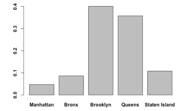


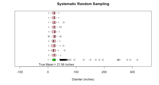


 or p. So she sent them out to collect data through random sampling. The 40 students each brought back samples. 40 different samples of 30 trees each.


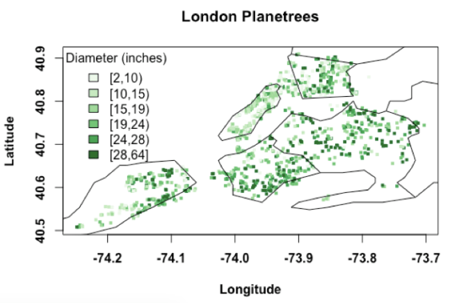


 confidence interval of the population mean (
![[\bar{x} - t_{\frac{\alpha}{2},(n-1)}\frac{s}{\sqrt{n}}, \bar{x} + t_{\frac{\alpha}{2},(n-1)} \frac{s}{\sqrt{n}}]](https://i0.wp.com/www.dataanalysisclassroom.com/wp-content/ql-cache/quicklatex.com-e281b4a13eb99a041fda4e625a9d0225_l3.png?resize=244%2C24&ssl=1 "Rendered by QuickLaTeX.com") .
. ![[20.6 - 2.05\frac{9.06}{\sqrt{30}}, 20.6 + 2.05\frac{9.06}{\sqrt{30}}]](https://i0.wp.com/www.dataanalysisclassroom.com/wp-content/ql-cache/quicklatex.com-971a4576a208da20a1022fe476aee4d9_l3.png?resize=241%2C27&ssl=1 "Rendered by QuickLaTeX.com") .
. 


![[\bar{x} - Z_{\frac{\alpha}{2}}\frac{\sigma}{\sqrt{n}} \le \mu \le \bar{x} + Z_{\frac{\alpha}{2}}\frac{\sigma}{\sqrt{n}}]](https://i0.wp.com/www.dataanalysisclassroom.com/wp-content/ql-cache/quicklatex.com-f339c276292498a548fa04ed13cab06f_l3.png?resize=224%2C24&ssl=1 "Rendered by QuickLaTeX.com") as the
as the 


 tends to a t-distribution with (n-1) degrees of freedom.
 ), i.e., the quantile from the t-distribution corresponding to the upper tail probability of 0.025, and 29 degrees of freedom.
  ).”
).”
![[\frac{(n-1)s^{2}}{\chi_{u,n-1}}, \frac{(n-1)s^{2}}{\chi_{l,n-1}}]](https://i0.wp.com/www.dataanalysisclassroom.com/wp-content/ql-cache/quicklatex.com-1ea92ff68e1798d01ae19feefe652009_l3.png?resize=121%2C30&ssl=1 "Rendered by QuickLaTeX.com") . We can get the square roots of the confidence limits to get the confidence interval on the true standard deviation,” she said.
. We can get the square roots of the confidence limits to get the confidence interval on the true standard deviation,” she said. ![[\sqrt{\frac{(n-1)s^{2}}{\chi_{u,n-1}}}, \sqrt{\frac{(n-1)s^{2}}{\chi_{l,n-1}}}]](https://i0.wp.com/www.dataanalysisclassroom.com/wp-content/ql-cache/quicklatex.com-53e5cd03f87b68559fbc1e930d1e4bd6_l3.png?resize=157%2C32&ssl=1 "Rendered by QuickLaTeX.com") is called the
is called the  and
and  can be obtained from the Chi-square table, or, as you guessed, can be computed in R using a simple command. Try these,” she said.

 ) that are damaged.”
 confidence interval for the true proportion p is
 ![[\hat{p} - Z_{\frac{\alpha}{2}}\sqrt{\frac{\hat{p}(1-\hat{p})}{n}}, \hat{p} + Z_{\frac{\alpha}{2}}\sqrt{\frac{\hat{p}(1-\hat{p})}{n}}]](https://i0.wp.com/www.dataanalysisclassroom.com/wp-content/ql-cache/quicklatex.com-606e6710b5d5a431856604ffa8b09299_l3.png?resize=252%2C32&ssl=1 "Rendered by QuickLaTeX.com") , assuming that the estimate
, assuming that the estimate 
 as an approximation of the population distribution f. It is easy enough to think of drawing numbers with replacement from these 30 numbers. Since each value is equally likely, the bootstrap sample will consist of numbers from the original data, some may appear more than one time, and some may not appear at all in a random sample.” Jenny explained the core concept of the bootstrap once again before showing them the code to do it.
 . But, I want you to understand it by doing it yourself.