
On the eleventh day of February 2019, Jenny showed her students how to compute and visualize confidence intervals in R. Her demo included the confidence interval on the mean, variance/standard deviation, and proportions. She also presented the code to develop bootstrap confidence intervals for any parameter. All this was based on a random sample that she collected.

But she wanted the students to have hands-on experience of data gathering and know the real meaning of confidence intervals, in that, for a 95% level, there is a 95% probability of selecting a sample for which the confidence interval will contain the true parameter value,  or p. So she sent them out to collect data through random sampling. The 40 students each brought back samples. 40 different samples of 30 trees each.
~~~~~~~~~~~~~~~~~~~~~~~~~~~~~~~~~~~~~~~~~~~~~~~~~~~~~~~~~~~~~~
On the eighteenth day of February 2019, the students came back with the samples. They all developed confidence intervals from their samples. Jenny showed them how the sample mean was converging to the true mean, and that over 40 confidence intervals, roughly two (5%) may not contain the truth. They also learned how the interval shrinks as one gets more and more samples.

Then, Jenny wanted them to understand the issues with sampling. So she sent them off for a second time. This time, the students divided themselves into teams, visiting different boroughs and collecting samples only from that borough.
Today, they are all back with their new samples.
~~~~~~~~~~~~~~~~~~~~~~~~~~~~~~~~~~~~~~~~~~~~~~~~~~~~~~~~~~~~~~

Monday, February 25, 2019
In which the students come back with new samples, borough wise. Jenny explains the traps due to sampling bias and the basic types of sampling strategies.
It is Samantha who is always at the forefront of the class. She was leading seven other students in team Manhattan. Each of these eight students gathered data for 30 trees in Manhattan. So, they create eight different confidence intervals — representing the intervals from Manhattan. Samantha shows her example — the locations of the data that she gathered and the confidence interval of the true mean.
The 95% confidence interval of the true mean diameter  is
is 

“This sample may or may not contain the true mean diameter, but I know that there is a 95% probability of selecting this sample which when used to develop the confidence intervals, will contain the truth,” she said.
John was heading team Bronx. He followed Samantha to show the places he visited and the confidence interval from his sample. His team also had eight students, and each of them gathered data for 30 trees from the Bronx.

John strongly feels that he may be the unfortunate one whose confidence interval will not contain the truth. He may be one among the two. Let’s see.
The leaders of the other three teams, Justin, Harry, and Susan also prepare their confidence intervals. They all go up to the board and display their intervals.
“From last week, we know that the approximation for the true mean is 21.3575,” said Samantha as she projects the vertical line to show it. As you all know, Jenny showed last week that the sample mean was converging to 21.3575 as the samples increased. The principle of consistency.

As they discuss among themselves, Jenny entered the room and gazed at the display. She knew something that the students did not know. But she concealed her amusement and passed along the file to collect the data from all 40 students.

Like last week, the students fill out the file with the data they collected, borough wise. The file will have a total of 1200 row entries. Here is the file. As you have rightly observed, the boro code column is now ordered since the file went from team Manhattan to team Staten Island.
Jenny used the same lines as last week to create a plot to display all the 40 confidence intervals.
Assuming that the file is in the same folder you set your working directory to, you can use this line to read the data into R workspace.
# Reading the tree data file from the students - boro wise #
students_data_boro = read.csv("students_data_borough.csv",header=T)
Use these lines to plot all the confidence intervals.
# Jenny puts it all together and shows #
# 40 students went to collect data from specific boroughs in NYC #
# Each student collects 30 samples #
# Each student develops the confidence intervals #

 nstudents = 40
 nsamples = 30

 students = 1:nstudents

 alpha = 0.95
 t = alpha + (1-alpha)/2

 sample_mean = matrix(NA,nrow=nstudents,ncol=1)
 sample_sd = matrix(NA,nrow=nstudents,ncol=1)
 ci_t = matrix(NA,nrow=nstudents,ncol=2)

 for(i in 1:nstudents)
 {
   ind = which(students_data_boro$student_index == i)
 sample_data = students_data_boro$tree_dbh[ind]
 sample_mean[i] = mean(sample_data)
 sample_sd[i] = sd(sample_data)
 cit_lb = sample_mean[i] - qt(t,df=(n-1))((sample_sd[i]/sqrt(n)))
 cit_ub = sample_mean[i] + qt(t,df=(n-1))((sample_sd[i]/sqrt(n)))
 ci_t[i,] = c(cit_lb,cit_ub)
 }

# Plot all the CIs #
 stripchart(ci_t[1,],type="l",col="green",main="",xlab="Diameter (inches)",xlim=c(9,30),ylim=c(1,nstudents))

 stripchart(sample_mean[1],add=T,col="green")

 for (i in 2:nstudents)
 {
   stripchart(ci_t[i,],type="l",col="green",main="",add=T,at = i)
   stripchart(sample_mean[i],col="green", add=T, at = i)
 }
Once you execute these lines, you will also see this plot in your plot space.

“It looks somewhat different than the one we got last time,” said John.
“Let me see how many of them will contain the truth,” he added as he typed these lines.
He looks through all the confidence intervals for whether or not they cover the truth using an if statement. He calls them “false_samples.” Then, he plots all the confidence intervals once again, but this time, he uses a red color for the false samples. He also added the borough names to give a reference point.
nyc_random_truth = 21.3575

false_samples = students

 for (i in 1:nstudents)
 {
   if( (ci_t[i,1] > nyc_random_truth) || (ci_t[i,2] < nyc_random_truth) )
 {false_samples[i]=1} else
 {false_samples[i]=0}
 }

false_ind = which(false_samples == 1)

# Plot all the CIs; now show the false samples #
 stripchart(ci_t[1,],type="l",col="green",main="",xlab="Diameter (inches)",xlim=c(9,30),ylim=c(1,nstudents))

 stripchart(sample_mean[1],add=T,col="green")

 for (i in 2:nstudents)
 {
   stripchart(ci_t[i,],type="l",col="green",main="",add=T,at = i)
   stripchart(sample_mean[i],add=T,col="green",at = i)
 }

 abline(v=nyc_random_truth,lwd=3)

 for (i in 1:length(false_ind))
 {
   j = false_ind[i]
 stripchart(ci_t[j,],type="l",col="red",lwd=3, main="", add = T, at = j)
   stripchart(sample_mean[j],col="red", lwd=3, add=T, at = j)
 }

 text(18,4,"Manhattan")
 text(24,12,"Bronx")
 text(27,20,"Brooklyn")
 text(28,28,"Queens")
 text(28,37,"Staten Island")
Try it yourself. You will also see this plot.

The students are puzzled. Clearly, there are more than 5% intervals that do not cover the truth. Why?
Jenny explains sampling bias
Jenny now explains to them about sampling bias. She starts with a map of all the data that the students brought.
We will get a more detailed explanation for creating maps in R in some later lessons. For now, you can type these lines that Jenny used to create a map.
### Full Map ###
 library(maps)
 library(maptools)
 library(RColorBrewer)
 library(classInt)
 library(gpclib)
 library(mapdata)
 library(fields)

 plotvar <- students_data_boro$tree_dbh

 nclr <- 6 # Define number of colours to be used in plot

 plotclr <- brewer.pal(nclr,"Greens") # Define colour palette to be used

# Define colour intervals and colour code variable for plotting
 class <- classIntervals(plotvar, nclr, style = "quantile")
 colcode <- findColours(class, plotclr)
 plot(students_data_boro$longitude,students_data_boro$Latitude,cex=0.55,pch=15, col = colcode, xlab="Longitude",ylab="Latitude",font=2,font.lab=2)

 map("county",regions ="New York",add=T)

 title("London Planetrees")

 legend("topleft", legend = names(attr(colcode, "table")), fill = attr(colcode, "palette"), cex = 1, bty = "n",title="Diameter (inches)")
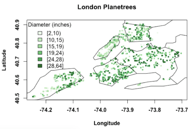
“Look at this map. I am showing the location of the tree based on the latitude and longitude you all recorded. Then, for each point, I am also showing the diameter of the tree using a color bar. Thick trees, i.e., those with larger diameters are shown in darker green. Likewise, thin trees are shown in lighter green. Do you notice anything?” asked Jenny.
Samantha noticed it right away. “The trees in Manhattan have smaller diameters. Mostly, they have dull green shade,” she said.
“Precisely,” Jenny continues. “The trees are not all randomly distributed. They are somewhat clustered with smaller diameters in Manhattan and Bronx and larger diameters in the other boroughs.
Since you collected all your samples from a specific borough, there is a risk of sampling bias.
We can make good inferences about the population only if the sample is representative of the population as a whole.
In other words, the distribution of the sample must be like the distribution of the population from which it comes. In our case, the trees in Manhattan are not fully representative of the entire trees in the City. There was sampling bias, a tendency to collect a sample that is not entirely representative of the population.
For team Manhattan, since the distribution of your sample is dissimilar to that of the population, your statements about the truth are not accurate. You will have a bias — poor inference.
See, the sample mean also does not converge. Even at n=1200, there is still some element of variability.

Last week when you collected data for the trees, I asked you to gather them randomly by making sure that you visit all the boroughs. In other words, I asked you to collect random samples. Randomly visiting all the boroughs will avoid the issues arising from sampling bias. They give a more representative sample and minimize the errors in the inference. That is why we did not see this bias last week.”
“Are there types of sampling?” asked Justin.
Jenny replied. “At the very basic level, “simple random sampling” method, “stratified random sampling” method and “cluster random sampling” method. One of these days, I will show you how to implement these sampling strategies in R. For now let’s talk about their basics.
What you did in the first week was a simple random sampling method. Your sampling frame was all possible London planetrees in NYC. Each tree in this frame has an equal chance of being selected. From this frame, you randomly selected 30 trees. This is sampling without replacement. You did not take the measurements for the same tree two times. Computationally, what you did was to draw without replacement, a sequence of n random numbers from 1 to N. Mostly, you will get an equal proportion of trees from each borough.
Then there is the stratified random sampling method. Here, we can divide the population into strata — subpopulations or separate sampling frames. Within each frame or strata, we can do simple random sampling to collect data. The number of samples taken from each stratum or subpopulation is proportional to the size of the stratum. In other words, if we know the percent number of trees in Manhattan compared to the total number of trees, we can approximately sample that percentage from the Manhattan strata. One thing I can do is to assume that each of your teams got a simple random sample from a stratum, and combine the five teams to give me a full representative sample. An inference from this combined sampled will be more accurate than individual strata samples.
In the cluster random sampling method, we can first divide the population into clusters and then randomly select some clusters. The data from these clusters will make up the sample. Imagine that we divide the city into zip codes — each zip code is a cluster. Then we can randomly select some zip codes as part of our sampling strategy. All the trees in these zip codes make up our cluster random sample. However, if there is not much variability within each cluster, we run the risk of not representing the entire population, and hence poor inference.
We can also do systematic sampling, like selecting every 10th tree, but again, we should ensure that we cover the range. If not, we might get a biased sample.”
“How did you know that the borough wise sampling would be biased?” asked someone.
Well, for a one-line answer, you can say it was an educated guess. For a one-lesson answer, you should wait till next week.
If you find this useful, please like, share and subscribe.
You can also follow me on Twitter @realDevineni for updates on new lessons.